
2026
2022
2025
2024
2023
SKILLS & DRILLS is one of the largest annual contemporary and street dance festivals in the Russian Far East. For 4–5 days, it transforms into
an intensive creative laboratory – a rare opportunity for dancers outside major cultural centers to immerse themselves in a professional environ-ment of this scale. Each year, the festival brings together leading figures of the dance industry and plays an important role in shaping the regional dance scene.
an intensive creative laboratory – a rare opportunity for dancers outside major cultural centers to immerse themselves in a professional environ-ment of this scale. Each year, the festival brings together leading figures of the dance industry and plays an important role in shaping the regional dance scene.
I developed the visual language for the festival’s last five editions, though this case study focuses on the two most defining recent years. As our collaboration evolved, the organizers gave me more creative freedom and increasingly trusted my artistic direction. Starting in 2024, I was able to rethink the visual system more radically – moving away from outdated solutions and shaping a stronger, more cohesive identity for the project.
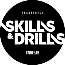
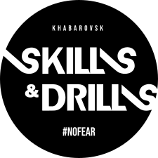
Each year, the logo receives a new graphic interpretation that sets the tone for the festival’s visual identity. From the organizers, I usually receive only a color and a general feeling for the upcoming edition – the concept development and overall character remain in my hands.
While working on the 2025 version, I decided to redesign the mark itself. The original logo the project came to me with no longer matched the strength of the surrounding visuals, and it felt important to push the identity further. I felt that the team was ready for this step and trusted
my creative direction.
I refined the letterforms by adjusting proportions and improving
the structure of the S, bringing R, K, and L to a more unified sharpness, balancing the weight of each character, and adjusting the spacing throughout. The updated logo became cleaner and stronger.
The redesign was approved immediately without revisions.
While working on the 2025 version, I decided to redesign the mark itself. The original logo the project came to me with no longer matched the strength of the surrounding visuals, and it felt important to push the identity further. I felt that the team was ready for this step and trusted
my creative direction.
I refined the letterforms by adjusting proportions and improving
the structure of the S, bringing R, K, and L to a more unified sharpness, balancing the weight of each character, and adjusting the spacing throughout. The updated logo became cleaner and stronger.
The redesign was approved immediately without revisions.
logo’25 versions
#1


event teaser
Judge Lineup Posters
#1


The logo design, built around alternating lines, allowed me to develop a distinctive and functional graphic shape that became a recurring element throughout the identity system.
#1
social media design
merch
#1
#1
part of the festival info deck


badges
personal badges
for special guests, organizers, and staff
for special guests, organizers, and staff
personal badges
for team leaders
for team leaders
#1
119
31


background screens
#1


personal screens for each performing team and solo dancer
264
awards
#1
audience ticket
#1
photo zone banner
#1


I eventually had the chance to experience that festival in person and finally see how my design lived in real space – on people, in motion, and throughout the environment itself. I was able to meet the team behind
the project and experience its atmosphere firsthand, which gave me a deeper understanding of the festival and naturally shaped my further work on its visual identity.
the project and experience its atmosphere firsthand, which gave me a deeper understanding of the festival and naturally shaped my further work on its visual identity.


The logo development process took significantly longer than usual: over 30 versions of the mark were created, along with numerous concepts for the festival’s teaser announcements. I explored a wide range of visual directions and unexpected solutions. At a certain point, my experiments drifted too far from the project’s original spirit, and the final direction only emerged once I returned to a more classic approach.
The 2026 edition was the festival’s 10th anniversary, making it especially important to distinguish it from previous years and shape the identity into something even bolder and emotionally charged. The organizers chose
a deep burgundy tone as the core color, one that brought to mind «fresh blood», emerging talent ripening like berries, and a deep love for dance itself – all things that felt especially meaningful for that milestone.
a deep burgundy tone as the core color, one that brought to mind «fresh blood», emerging talent ripening like berries, and a deep love for dance itself – all things that felt especially meaningful for that milestone.

logo’26
#2

The final version of the logo became an eye – an AI-generated image of a pupil that I refined by hand. This symbol represents passion, complete dedication to one’s craft, and the creative and professional vision the festival cultivates within its community.


key visual posters
#2
Judge Lineup Posters
#2


#2
festival info deck
#2
social media carousels


#2
festive stories
#2
social media design


badges
personal badges
for special guests, organizers, and staff
for special guests, organizers, and staff
personal badges
for team leaders
for team leaders
#2
158
63


choreo contest banner
#2


#2
awards


awards
#2
The festival winners received 3D-printed lamp trophies. I took part in developing the award’s form and visual concept, aiming to create an object that would feel not only like a prize, but also like an aesthetic piece people would genuinely want to keep in their space long after the festival ended.


background screens
#2


personal screens for each performing team and solo dancer
340


workshops banners
#2
workshops awards
#2


At the end of each workshop, choreographers selected their standout students and awarded them «SKILL KILL» cards – a form of personal respect from the teacher. Dancers who collected five or more cards received festival merch as a reward. For the card design, we revisited one of the early visual concepts I had originally developed as a direction for the festival’s main identity, though it was ultimately not selected. Within this format, however, the heart-shaped logo concept found its most natural expression, turning the cards into both a stylish collectible and a memorable keepsake for participants.


merch
#2
For the merch design, we returned again to early visual concepts I had originally created for the festival's identity and that the organizers especially loved. I developed the concepts and messaging behind the prints, which eventually evolved into a full collection. These pieces were designed to function as complete elements of an everyday wardrobe, not just training clothes dancers would end up sweating in at rehearsals.
For me, the message behind merch design is extremely important –
not necessarily ideological, but at least stylistic. I strongly reject the approach where merch is reduced to nothing more than a logo placed on a garment. This more thoughtful and soulful way led the 2025 and 2026 festival merch to sold out during the events themselves, followed by additional demand through post-festival preorders.
not necessarily ideological, but at least stylistic. I strongly reject the approach where merch is reduced to nothing more than a logo placed on a garment. This more thoughtful and soulful way led the 2025 and 2026 festival merch to sold out during the events themselves, followed by additional demand through post-festival preorders.


